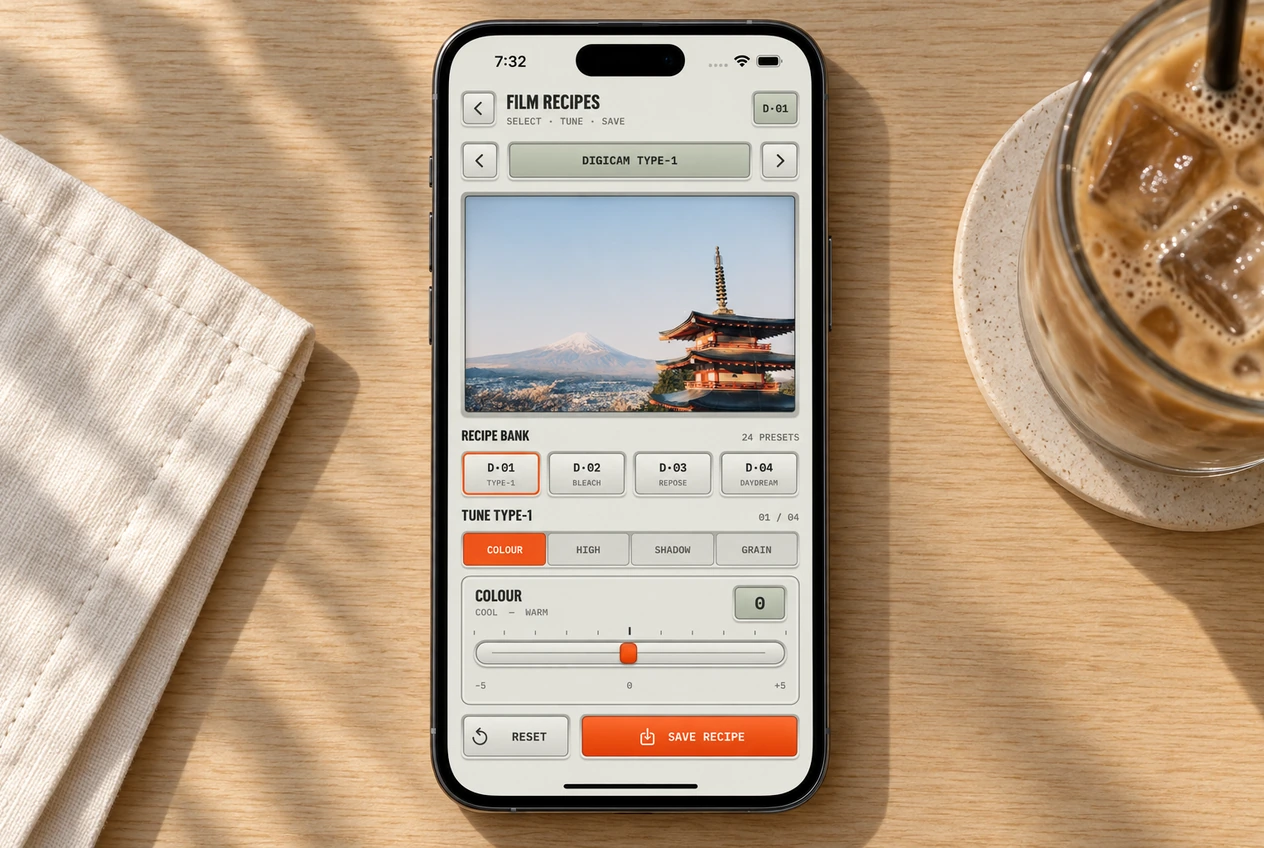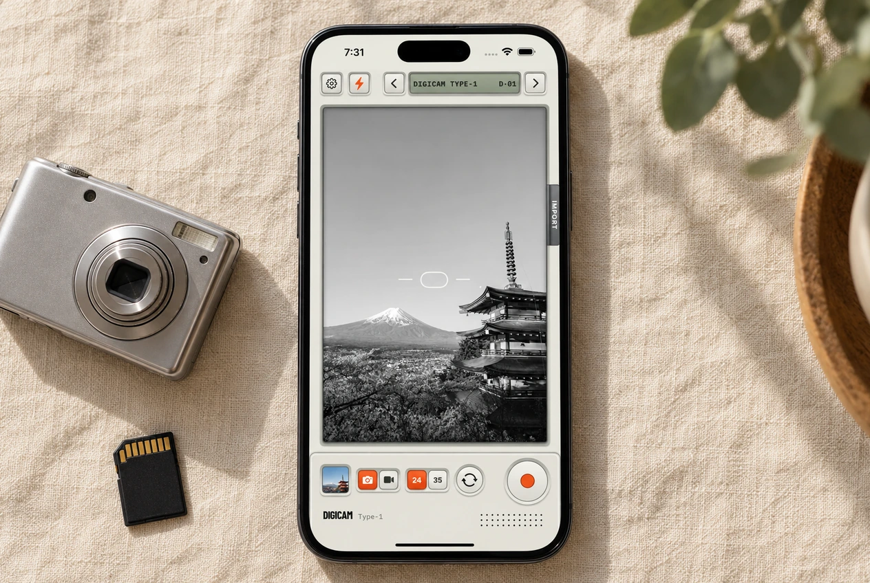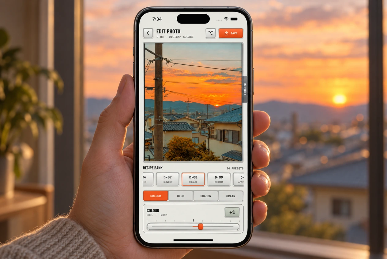
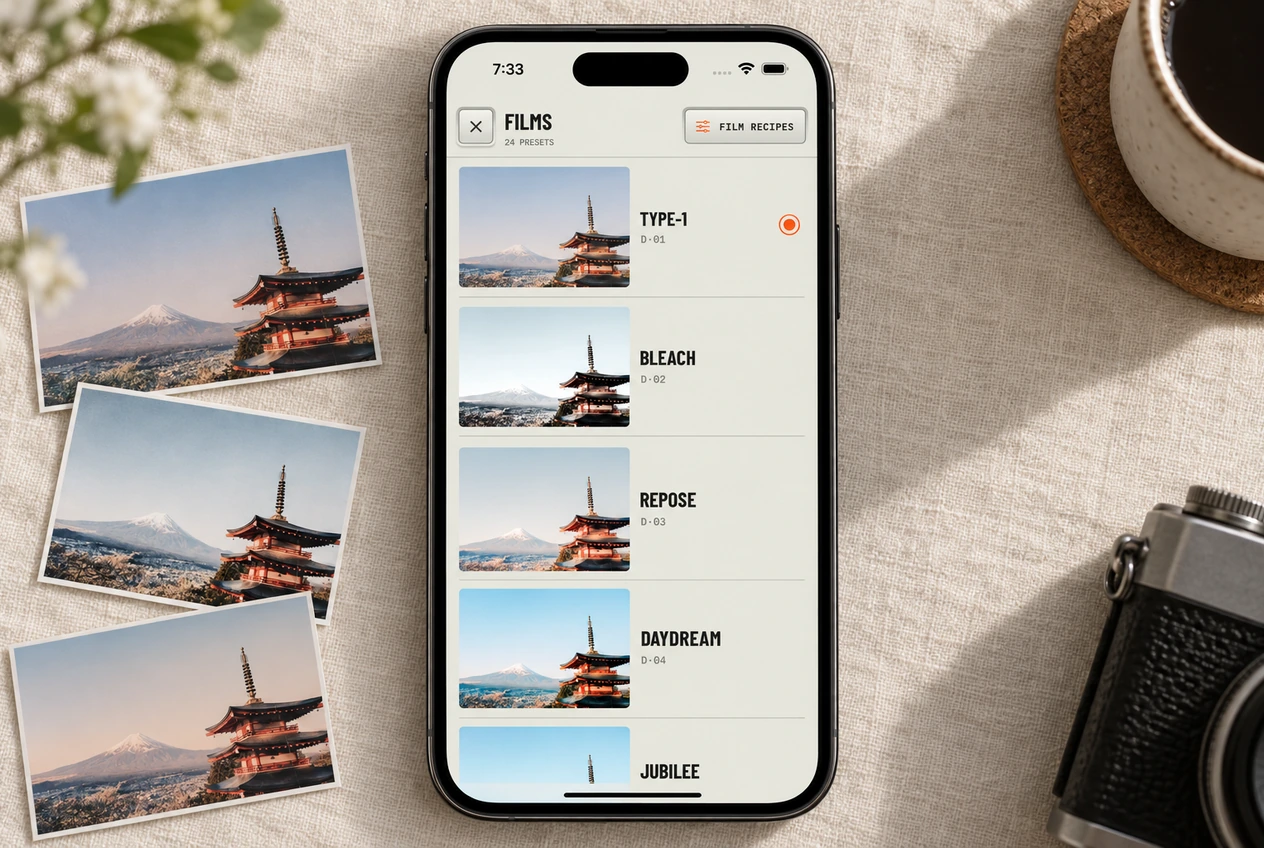
Start with Type-1, then compare it with one film that feels different. Think about the photos you want to bring home: dinner with friends, blue skies from a trip or the walk back after sunset. Digicam’s 24 looks are there to give those moments a feel you like.
How to switch films
Tap the arrows on the film selector at the top of the camera to step through them one at a time. Tap the film name to see all 24 on one screen and jump straight to one.
A few useful starting points
- Type-1 · D·01
- The starting point for warm, grainy everyday shots. Try it on the walk to the shops or a table full of friends.
- Bleach · D·02
- Try this when you want a paler, brighter result. Check the lightest parts of the frame before you settle on it.
- Chroma · D·09
- A useful first try for strong color and blue skies. Compare it on rooftops, painted walls or a bright day out.
- Noir · D·15
- Black and white. Look at the shape of the light and the separation between your subject and the background.
- Solace · D·08
- Try it on late light and warm scenes. Watch what it does to a sunset and to the shadows underneath it.
- Nightfall · D·24
- A darker look with grain and glow around bright lights. Try street lamps or station lights with some darkness around them.
These are starting suggestions, not rules for what you’re allowed to shoot. A film that works on a sunset might be your favorite for an indoor portrait. Let the actual photo decide.
All 24 films, in camera order
Type-1 stays first. The list then moves broadly from pale, bright previews toward deeper looks. The D codes help you find a film again; they aren’t strength levels.
- D·01Type-1
- D·02Bleach
- D·03Repose
- D·04Daydream
- D·05Jubilee
- D·06Wander
- D·07Harvest
- D·08Solace
- D·09Chroma
- D·10Afterglow
- D·11Daylight
- D·12Archive
- D·13Reportage
- D·14Hearth
- D·15Noir
- D·16True Tone
- D·17Blush
- D·18Solitude
- D·19Softlight
- D·20Portrait
- D·21Cinema
- D·22Hush
- D·23Reverie
- D·24Nightfall
Choose a look for the set you want to post
For a holiday carousel, compare Type-1 and Chroma on a scene with both a person and some sky. For an evening set, try Type-1 with the available light, then test flash for the close-up shots. Noir is worth a look when shapes and expressions interest you more than the color. These are ways to narrow the choice, not a fixed recipe for a good post.
Keep one film across a few photos if you want the set to feel connected. You can still let a darker shot or a black-and-white frame break it up. Every slide doesn’t have to match exactly.
How to compare without getting stuck
- Keep the scene still. Compare the same view with two or three films, rather than changing the subject each time.
- Check the subject first. For a portrait, look at the face before the sky. For a street scene, check whether the shadows still show what matters.
- Look at the bright areas. A pale sky can be part of the look, but make sure you like what happens to clouds, windows or a white shirt.
- Pick one and shoot for a while. You’ll learn more from a few real photos than from another lap through the selector.
For an even comparison, import one photo and try the films on it. The light and framing stay fixed, so it’s easier to see what each look changes.
Make any film yours
Every film has four sliders behind it. If you like the color but want less grain, change that one thing first. If you’re adjusting everything just to make a film work, try another starting point. The recipe guide explains how to save your tuning and restore a film’s defaults.